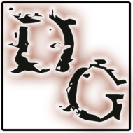

If you explored our site well enough, you probably found the reference to the origin of the “Demonground” term. This hearkens back to the tail end of the 1990’s, when the Dark Conspiracy 2nd edition was being released. The creator of the game selected a font for the title of the game called “Goodbye Cruel World”. It’s a wonderfully ornate True-Type Font that is cool to look at… and that’s when the coolness stops. It’s a nightmare to reproduce and print!!!! Each character in the font family is slightly ‘exploded’, so each spews little artifacts and splashes all around it. There are points in the font definition, where I swear the designer just took their pen and scribbled indiscriminately. But it’s the font we used for the original Demonground Fanzine, and it’s the name we carried onto the haunt. And as a result, a personal nightmare was born. How do I take that ornate font, and reproduce it onto our sign?
Then came the 3d Printer and the discovery of Translucent (and Semi-Transparent) PETG filament. It took a few weeks of learning how to get that crazy font to render, and a couple more weeks of playing to take those super-complex squiggles, and simplify them to a point where the computer could hold the collection in memory without bogging performance to a crawl. In the end, we finally managed to print the Demonground title exactly as originally designed.


